レイアウト要素の編集
| grandMA3 ユーザマニュアル » レイアウト » レイアウト要素の編集 | Version 2.2 |
レイアウト要素の編集は以下のよう行います。
- Layout View ウィンドウで、Setup をタップして Setup モードを有効にします。
 をタップし、2本指編集(タッチ操作 を参照)で要素を開きます。
― または ―
- Setup をタップして、レイアウト・エンコーダバーを有効にします。
- Layout View ウィンドウで、編集するレイアウト要素を選択します。
- レイアウト・エンコーダバーの Edit Selected をタップして、Layout Element Editor を開きます。
Edit Layout ウィンドウは、General、Arrangement、および Custom Text という3つのタブに分けられています。
General タブ
レイアウト要素に割り当てられているオブジェクトに関するすべてのプロパティを管理します。
General タブ
- Name: 仮想キーボードを開いて、選択している要素の名前を入力できます。
- ID: フィクスチャがレイアウトに割り当てられている場合、ここにフィクスチャIDが表示されます。詳しくは フィクスチャとは を参照してください。プール・オブジェクトが割り当てられている場合、IDはプール・オブジェクトの番号になります。
- CID: IDType が "Fixture" 以外の場合、ここに CID が表示されます。詳しくは ショーへのフィクスチャ追加 を参照してください。
- Object: Assignment Editor ポップアップが開きます。
- Action: Select Action ポップアップが開きます。要素をタップしたときに実行するアクションを選択します。
- <Layout Default> では、デフォルトのレイアウト要素に設定されたアクションに従います(レイアウトの作成 を参照)。
- <Object Default> に設定すると、それ自体のオブジェクト・アクションに従います。
- Appearance: Select Appearance ポップアップが開きます。<Default> では、割り当てられているアピアランスが用いられます。詳しくは アピアランス を参照してください。
- Full Resolution: 画像をフル解像度で表示するか(有効)、画質を落として表示するか(無効)を指定します。
- Mirror: レイアウト要素に表示されているアピアランスを、水平、垂直、または均等に鏡像反転させます。
- Appearance Rotation: 表示されているアピアランスを、90°、180°、または 270°回転させます。
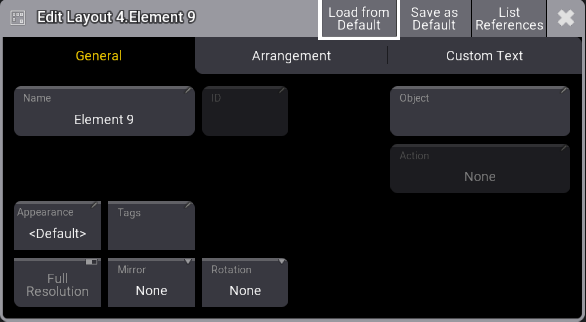
レイアウト要素のデフォルトは、タイトルバーの Save as Default をタップすることで作成できます。また、Menu を押して Preferences and Timings をタップすることでもデフォルトを設定できます。
 |
重要 |
| 高解像度の画像を多数表示していると、グラフィカル・ユーザインターフェースの動作が遅くなることがあります。この場合、ソフトウェアの動作が制限され、画像を低画質でレンダリングします。なお、150ピクセル以下の画像は、常に低画質で表示されます。 |
Arrangement タブ
レイアウト要素の位置と外観を管理します。
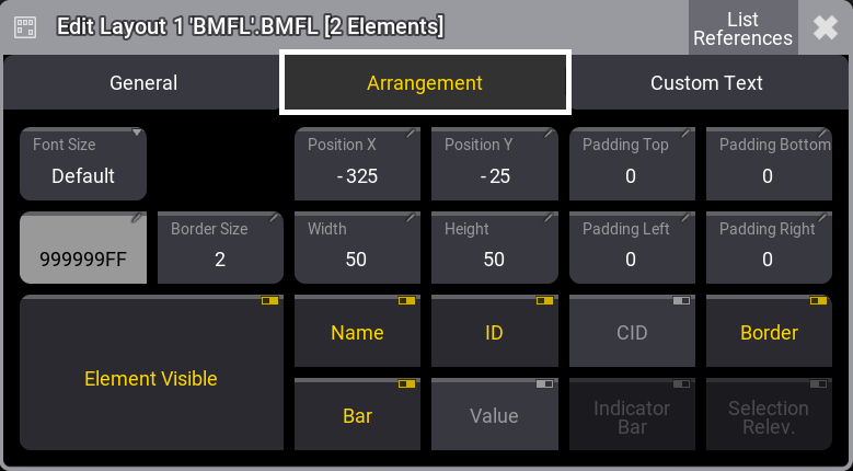
- Font Size: これらのボタンを用いて、カスタムテキストの配置をカスタマイズできます。レイアウト要素を専用のフォントサイズに設定すると、設定されたサイズでテキストが表示されます。
- Position X および Position Y: レイアウトでのX/Y位置を指定します。
- Padding Top, Padding Bottom, Padding Left, Padding Right: 要素の端と要素内容との間隔です。
- Border Color、Border Size: アウトラインの色とサイズを調整します。
- Width、Height: 要素の寸法を調整します。
- Element Visible: 要素の表示/非表示を切り替えます。
- Name、ID、CID、Boarder、Bar、および Value: レイアウト要素の名前、フィクスチャID、カスタムID、境界線、ディマーバー、および出力値の表示/非表示を切り替えます。
- Indicator Bar: プール・オブジェクトがレイアウト(例: グループ)に割り当てられている場合、その要素上にインジケータバーを表示するかどうかを指定します。
- Selection Relevance: 有効にすると、レイアウト要素の画像が For All または For Some 色で表示されます。詳しくは ウィンドウの設定 - Pool Settings を参照してください。
Custom Text タブ
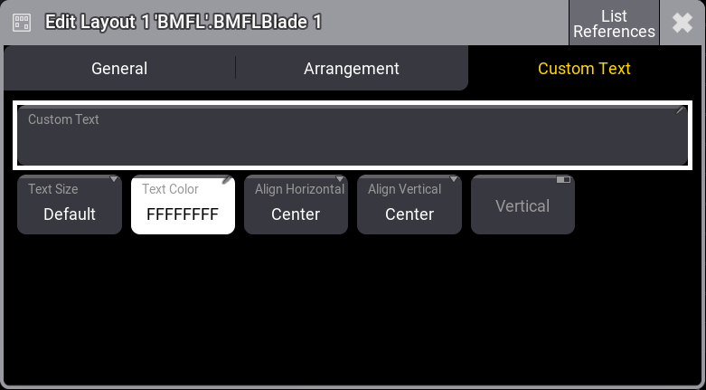
- Custom Text: 要素にカスタム・ラベルを追加します。レイアウト要素上で長すぎて表示できない部分はカットされます。
- Text Size and Text Color: Custom Text のサイズと文字色を個別に設定します。
- Align Horizontal: Custom Text の水平方向の配置です。
- Center: テキストをレイアウト要素の水平方向中央に揃えます。
- Left: テキストの左端を、レイアウト要素の左端に揃えます。
- Right: テキストの右端を、レイアウト要素の右端に揃えます。
- OutsideLeft: テキストの右端を、レイアウト要素の左端に揃えます。
- OutsideRight: テキストの左端を、レイアウト要素の右端に揃えます。
- Align Vertical: Custom Text の垂直方向の配置です。
- Center: テキストをレイアウト要素の垂直方向中央に揃えます。
- Top: テキストをレイアウト要素の内側上端に揃えます。
- Bottom: テキストをレイアウト要素の内側下端に揃えます。
- Above: テキストをレイアウト要素の外側上端に配置します。
- Below: テキストをレイアウト要素の外側下端に配置します。
- Vertical: 有効にすると、テキストが縦向きに表示されます。
 |
ヒント |
| 選択した複数のレイアウト要素を同時に編集できます。 |
|
ヒント |
| レイアウト要素の選択順によって、配置順が決まります。 |
|
ヒント |
| 異なるプロパティ値を持つ複数のレイアウト要素を選択した状態で、レイアウト要素のプロパティを切り替えると、それらは同時に切り替わって同じ値になります。 |
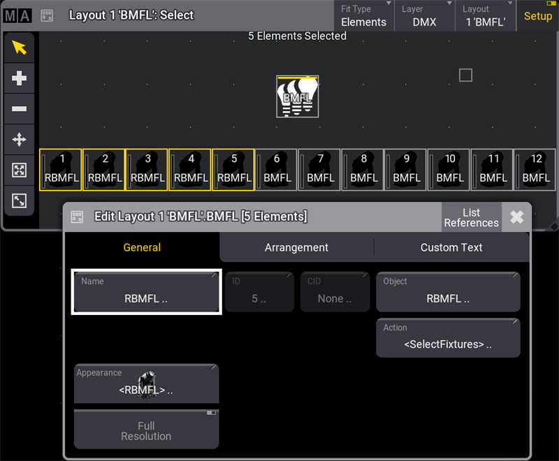
例
選択した複数のレイアウト要素を同時に編集するには、以下のようにします。
- タイトルバーの Setup をタップして有効にします。
- Layout Viewer ウィンドウで、さまざま フィクスチャを選択します。
- レイアウト・エンコーダバーの Edit Selected をタップして Layout Element Editor を開きます。詳しくは レイアウト・エンコーダバー を参照してください。
- Name ボタンをタップすると仮想キーボードが開きます。新しい名前を入力して Enter をタップします。
- Edit Layout ダイアログを閉じます。